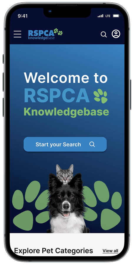
RSPCA Knowledge Base
Science backed hub where pet owners can look up information on animal welfare.
Project type: UX Design (concept project with RSPCA stakeholder input).
Timeline: Sept - Dec 2025 (10 weeks)
Mentor: Candy Crowhurst, Senior UX Designer
Project role: Sole UX/UI designer
Key skills: UX design, IA, wireframes, usability testing, hi-fi prototype & developer handoff.
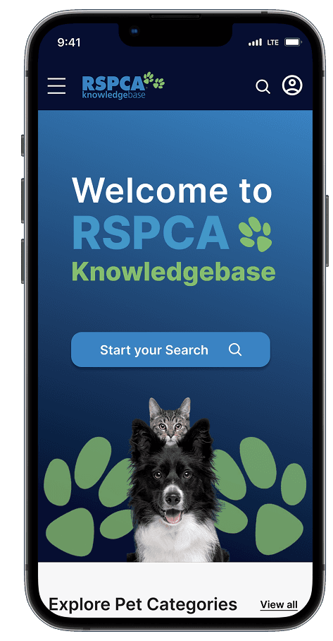
RSPCA Knowledge Base
Science backed hub where pet owners can look up information on animal welfare.
Project type: UX Design (concept project with RSPCA stakeholder input).
Timeline: Sept - Dec 2025 (10 weeks)
Project role: Sole UX/UI designer
Mentor: Candy Crowhurst, Senior UX Designer
Key skills: UX design, IA, wireframes, usability testing, hi-fi prototype & developer handoff.
TL;DR

No filtering options, unrelated & text heavy search results, no search icon
The problem
RSPCA's Knowledge Base serves three audiences, pet owners, vet students, and farmers, on the same pages. Searching "how to train dogs" will get you pet transport carrier advice next to glue board legalities, with no way in filtering the results. For a pet owner trying to help their pet, that means digging through content that was never meant for them.
Key decisions
Made search the singular focus of the home page instead of adding navigation
Built a guided filter flow (pet type —> topic —> Animal needs) rather than inline filters
Replaced dense text results with scannable image-and-header cards
Outcome
In final testing, all 4 participants completed a filtered article search unassisted, a task that previously created friction due to mixed, unfiltered results. 3 out of 4 participants said the related articles feature would bring them back.
Heres where that gap between Knowledge Base and its pet owners actually started
RSPCA Knowledge Base
Science backed hub where pet owners can look up information on animal welfare.
Project type: UX Design (concept project with RSPCA stakeholder input).
Timeline: Sept - Dec 2025 (10 weeks)
Project role: Sole UX/UI designer
Mentor: Candy Crowhurst, Senior UX Designer
Key skills: UX design, IA, wireframes, usability testing, hi-fi prototype & developer handoff.
PROJECT OVERVIEW
The client
RSPCA is an independent community based charity focused on providing animal care and protection services across Australia. RSPCA works to make animals lives better through rehoming shelters, investigating animal cruelty and advocating for animal welfare.
Knowledge Base is RSPCA's resource centre providing animal welfare and pet care advice. It serves pet owners, vet students, and farmers.
I interviewed Andrew Curin, RSPCA's Digital Marketing and Strategy Officer, to understand where Knowledge Base was falling short.
The problem in Andrews words
Andrew confirmed pet owners drive the majority of Knowledge Base's engagement, yet according to Knowledge Base's analytics, 90% don't return.
He pointed to the cause directly:
“The content on the site is too overwhelming for users. Theres a lot of scientific articles being featured.”
Stakeholder Interview quote by Andrew Curin
Knowledge Base's business goal
To increase engagement and return visits by 20%. In a 10-week concept project I couldn't measure time on site directly, so I used two proxies I could measure:
Task success
Can pet owners find a specific article without help?
Return intent
Can pet owners say they'd return back to Knowledge Base and can they point to why?
The project constraints I'm working with
I tested with 4 participants recruited from my own network who are animal lovers, but are not existing Knowledge Base users. That means my findings reflect first-time usability, not habitual behaviour. With Knowledge Base access, my next step would be to test with returning pet owners.
TL;DR
No filtering options, unrelated & text heavy search results, no search icon
THE PROBLEM
Knowledge Base serves 3 audiences on the same page: pet owners, vet students, and farmers. Searching "how to train dogs" will get you 'pet transport carrier' advice next to 'glue board legalities,' with no way to filter the results.
For a pet owner trying to help their pet, that means digging through content that was never meant for them.
KEY DECISIONS
Made search the singular focus of the home page instead of adding navigation.
Built a guided filter flow (pet type —> topic —> animal needs) rather than inline filters.
Replaced dense text results with scannable image-and-header cards.
OUTCOME
In final testing, all 4 participants completed a filtered article search unassisted, a task that previously created friction due to mixed, unfiltered results. 3 out of 4 participants said the related articles feature would bring them back.
OUTCOME
In final testing, all 4 participants completed a filtered article search unassisted.
A task that previously created friction due to mixed, unfiltered results. 3 out of 4 participants said the related articles feature would bring them back.
Heres where that gap between Knowledge Base and its pet owners actually started —>
The client
PROJECT OVERVIEW
The client
RSPCA is an independent community based charity focused on providing animal care and protection services across Australia. RSPCA works to make animals lives better through rehoming shelters, investigating animal cruelty and advocating for animal welfare.
Knowledge Base is RSPCA's resource centre providing animal welfare and pet care advice. It serves pet owners, vet students, and farmers.
I interviewed Andrew Curin, RSPCA's Digital Marketing and Strategy Officer, to understand where Knowledge Base was falling short.
The problem in Andrews words
Andrew confirmed pet owners drive the majority of Knowledge Base's engagement, yet according to Knowledge Base's analytics, 90% don't return.
He pointed to the cause directly:
“The content on the site is too overwhelming for users. Theres a lot of scientific articles being featured.”
Stakeholder Interview quote by Andrew Curin
Knowledge Base's business goal
To increase engagement and return visits by 20%. In a 10-week concept project I couldn't measure time on site directly, so I used two proxies I could measure:
Task success
Can pet owners find a specific article without help?
Return intent
Can pet owners say they'd return back to Knowledge Base and can they point to why?
The project constraints I'm working with
I tested with 4 participants recruited from my own network who are animal lovers, but are not existing Knowledge Base users. That means my findings reflect first-time usability, not habitual behaviour. With Knowledge Base access, my next step would be to test with returning pet owners.
RESEARCH
Building on existing research
Victoria Tran had previously interviewed 7 participants (animal lovers, 18+) about Knowledge Base. Before building on her findings, I reviewed her raw notes against her themes to check they held up. Three ideas did:
The tone doesn't speak to pet owners
“I kept clicking around but couldn’t find what I needed. It just felt like information, not something for me.”
Exploration lead to a dead end
“After adoption, the information felt scattered, and I didn’t feel connected to the bigger cause. It was like the journey just stopped there.”
The content lacks emotional content
3 out of 7 participants couldn't connect with pet content buried in statistics and reports.
Doing my own evaluation
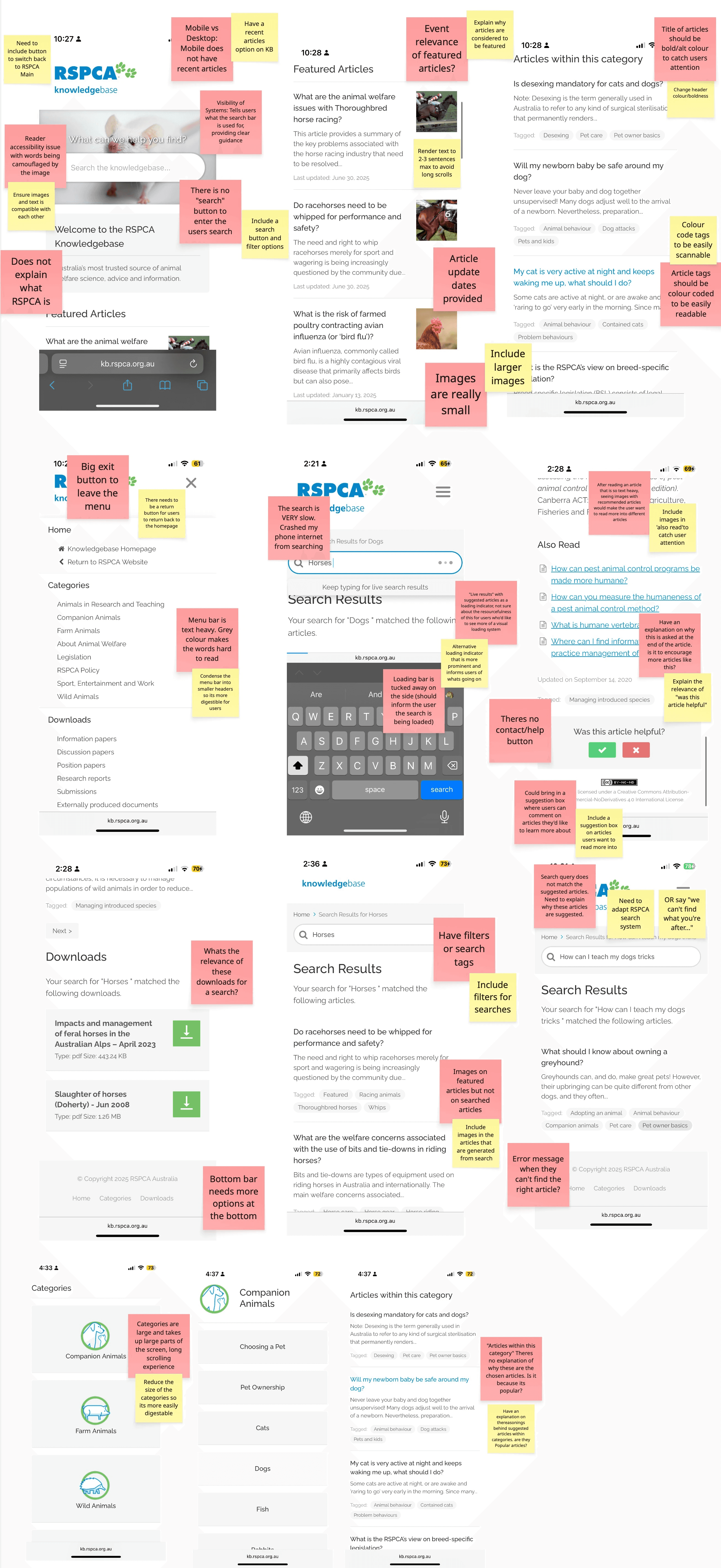
I ran a heuristic evaluation of the current Knowledge Base (Nielsen Norman principles) and found four problems that mapped directly onto Victoria's themes:
No wayfinding
No clear calls to action or visual cues between pathways
Missing basics
No search or return buttons. Users fall back on their phone keyboard.
Academic language
Terms like "downloads" and "legislation" mean nothing to a pet owner (confirmed later in my own usability tests).
Unfiltered and unreadable results
Farm animal content mixed with pet content, no filters and small grey compact text.
What I learned from other sites and why they worked
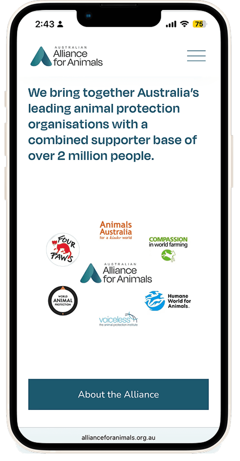
Alliance for Animals is an Australian charity and coalition of leading animal organisations working to reform the animal welfare system. Their aim is to change laws that currently treat animal welfare as a minor concern.
Design insight
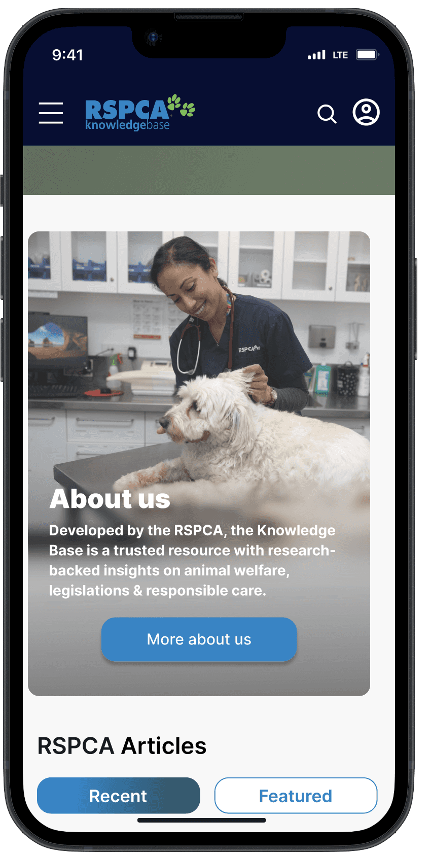
Alliance for Animals leads with a clear purpose statement on first scroll, helping users understand who the organisation is and why it exists. This clarity supports user trust, while providing them a reason to continue exploring the page.
How this informs my design
I incorporated a clear purpose statement in Knowledge Base's "About" section instead of the landing screen. In hindsight, that's a decision I'd want to test, a purpose statement above the fold might help first-time visitors orient faster. I'd want data to know if that matters more than immediate access to search.
Animals in Alliance landing
About section
The Guardian is a British daily newspaper and global digital news organisation.
Design insight
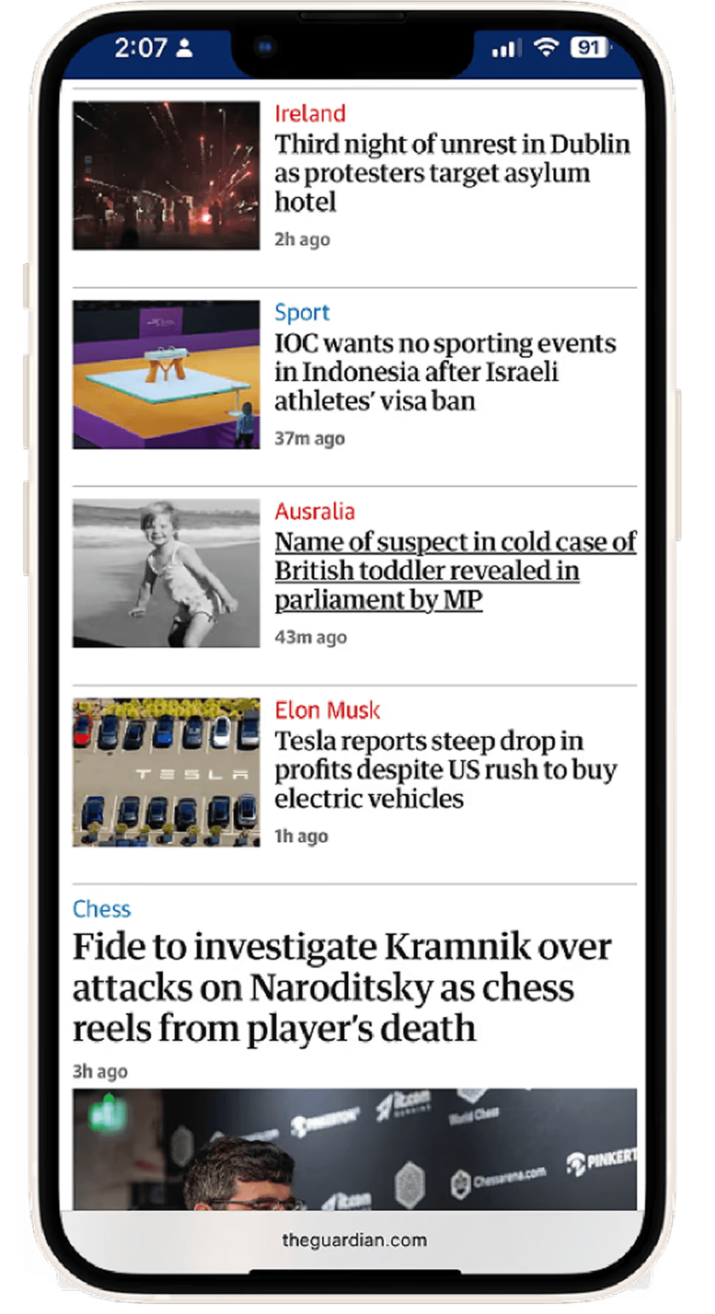
The Guardian uses bold headers and colour-coded tags so readers can judge relevance in one scan.
How this informs my design
I adapted this directly into my search results using imagery and colour coding for my article cards. You can see it in the final search results screen.
The Guardian article layout

Final search results screen
IDEATION
A question I needed to explore
How might pet owners find their content in a hub built for three audiences?
This idea became a tradeoff. By prioritising pet owners, it meant de prioritising vet students and farmers on shared surfaces like the home page and the search bar.
This call was made deliberately as pet owners are the dominant audience and the main retention problem. I made sure to also preserve access for other audiences through the filtering system, rather than removing their content
This idea became a tradeoff. By prioritising pet owners, it meant de prioritising vet students and farmers on shared surfaces like the home page and the search bar.
This call was made deliberately as pet owners are the dominant audience and the main retention problem. I made sure to also preserve access for other audiences through the filtering system, rather than removing their content.
Why mobile first
I designed mobile first because Andrew told me most users research pet care content on their phones, especially when they're worried about their pets. Its more instinctual. The current site's failures, tiny text, not-thumb-reachable controls, hurt most on small screens, areas most pet owners are struggling with.
Exploration
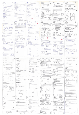
Using Crazy 8s, I sketched layout options for the home screen and search flow. Two decisions came out of this stage worth explaining:
Decision 1 — Search bar as the home page hero.
Andrew's analytics showed 65.4% of users start on the home page. Rather than fight that behaviour with more navigation, I made search the single focal point of the landing screen.
Decision 2 — A guided filter step instead of inline filters.
The current site's biggest problem is irrelevant results. I chose a dedicated step-by-step filter flow over inline filter chips because the site has a lot of content across three audiences. Showing every filter option at once can be overwhelming.
This bore out in testing: participants were overwhelmed by the number of toggles when filters were presented all at once. They were confused by the tags section especially, where it was upfront complex.
The tradeoff: it adds a step for confident users. I accepted that because the audience is infrequent visitors, not people who already know the site well enough to filter quickly on their own.
Constructing the idea
Home
Centred search and pet categories surface first.
Filter
Guided steps through animal category, subject and animal topic.

Search Results
Image + header + tags cards replace the wall of text giving one decision per card for digestible scrolling.
Article Layout
22.3% (based on KB analytics) of users land directly on articles from external links, making this many users' first impression. I ended every article with related-article prompts so the journey doesn't have a dead-end (directly addressing Victoria's third theme).

USABILITY TESTING
I tested a mid-fi prototype with 4 participants (3 in person, 1 remote), all animal lovers recruited from my network. Four tasks, moderated, think-aloud.
The goal of these usability tests was to evaluate the functionality and usability of the filters section, and to determine whether the designs would resonate with pet owners enough to encourage return visits to the site.
Task 1 — Explore the home page
What worked
3 out of 4 participants liked pet articles grouped into swipeable topic carousels.
What broke
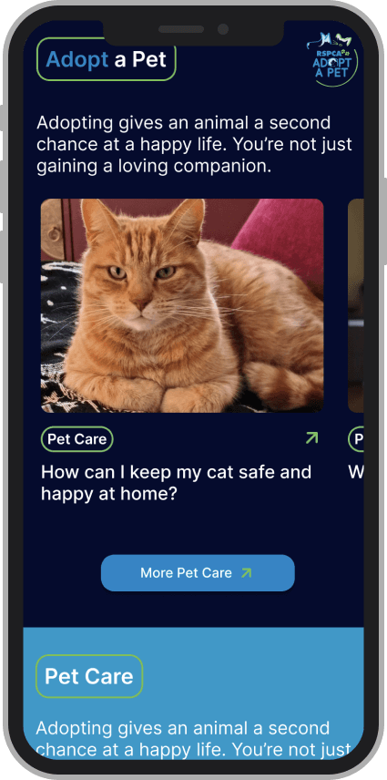
All 4 read 'Adopt a Pet' and 'Pet Care' as the same category. Identical layouts made them visually interchangeable.
What I changed
Gave each category its own identity through distinct components, colour, and an adoption quiz entry point.
"You could literally change this to ‘thinking about adoption?’ and then I feel like it would call back to adoption articles more."
Interview quote from Libby C
Mid-fi carousel showing the two pet carousels.
Task 2 — Start a search
What worked
Colour-coded filter categories helped all 4 participants track where they were in the flow.
What broke
All 4 stumbled on terms like "downloads" and "animals in research and teaching," academic labels with no meaning to a pet owner.
What I changed
Removed or relocated academic terminology from the pet-owner filter path.
"What’s the relevance of that to me, as a casual pet owner?"
Interview quote from Esther
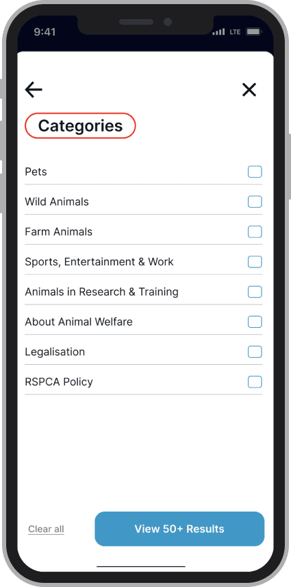
Mid-fi filter showing page with terms that confused users.
Task 3 — Apply filters
What worked
Having filters laid out with its categories and a brief description provided guidance on the functionality of the page.
What broke
All 4 users pressed the 'Tags' header thinking it was a button. The outline made it read as interactive. Participants were also overwhelmed by the number of toggles and confused by the functionality of the tags section.
What I changed
Redesigned the header to be visually distinct from buttons. I replaced tags with single "animal topic" to specify user search.
"This feels like a button, I think, probably because of the outline."
Interview quote from Kiran

Mid-fi filter with visually confusing and overwhelming elements.
Task 4 — Find and read an article
What worked
3 out of 4 participants liked the images breaking up the text (the current site has one image per article, at the top).
What broke
Subheadings styled as buttons confused all 4; oversized body text in long paragraphs felt overwhelming.
What I changed
Shorter paragraphs, smaller body type, subheadings restyled as clearly non interactive.
“I’m just not used to the huge blocks of text, especially with the font size being so large."
Interview quote from Esther
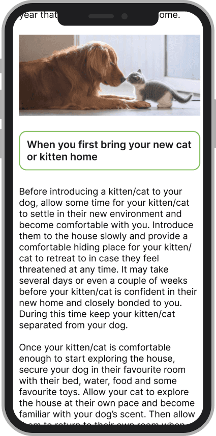
Mid-fi articles layout with subheading and text.
FINAL DESIGN
Three principles drove the final prototype
Pet content first
Pet owners see their content in every surface.
One decision per screen
Cards, guided filters, and clear hierarchy replace walls of text.
No dead ends
Every article closes with a path to explore Knowledge Base.

Results — what I can actually claim
—> All 4 participants completed a filtered search and found a specific article unassisted
A task the current site doesn't support at all, since it has no filtering to begin with.
—> 3 out of 4 participants said the related articles section would bring them back
(The closest proxy I could measure for RSPCA's return-visit goal)
In post test, participants described the redesigned search as easier to scan, with no re-reading or backtracking observed (behaviour that was constant on the current site).
Home page
The home page is centre with a button as a call to action to prompt users to start their search.
Pet categories and pet related content is readily available.
Filter search
Users can use the filter to specify their search.
Users can return back to the main filter page to continue filtering or start their search whenever by clicking "view results."
Filter
Users have access to the filters they applied to their search.
Users can edit and delete the filters depending on their needs.
Article
The articles layout consists of smaller texts and sub headings.
At the end of the article, call to action components are integrated to encourage users to continue exploring Knowledge Base.
80% of users said they liked that there were suggested related articles at the end.
REFLECTION
What I learned
Restructuring dense information into scannable sections did more for findability than any single component I designed.
Building with spacing systems, grids, and reusable components kept the design consistent as it grew. My first real design-systems muscle.
Testing taught me to hold my decisions loosely: two things I was confident about (the tags section, the button-styled subheadings) failed with every participant.
What I'd do next for Knowledge Base
Test the current site and the redesign on identical timed tasks to produce a defensible before/after benchmark.
Validate the new filter taxonomy with actual Knowledge Base users, especially returning pet owners.
Check the redesign doesn't degrade the experience for vet students and farmers — the audiences I deliberately de-prioritised.
Feedback
Andrew Curin - RSPCA’s Digital Marketing and Strategy Officer
"The category organisation and pet colour coding was not only visually pleasing but also accessibility friendly. It makes the categories more intuitive and easy to navigate."
Candy Crowhurst - Senior UX designer, Mentor
"You did an excellent job highlighting accessibility issues within the current RSPCA Knowledge Base. This demonstrated a strong understanding of inclusive design principles and the importance of designing for a broad range of users."
Up next…
Other projects
Karen Huang
Thank you for your interest in my work!
If you’re looking for a UX Designer who cares a lot and loves a good laugh, send me a message, I’d love to connect!
Karen Huang
Thank you for your interest in my work!
If you’re looking for a UX Designer who cares a lot and loves a good laugh, send me a message, I’d love to connect!
Karen Huang
Thank you for your interest in my work!
If you’re looking for a UX Designer who cares a lot and loves a good laugh, send me a message, I’d love to connect!
RESEARCH
Building on existing research
Victoria Tran had previously interviewed 7 participants (animal lovers, 18+) about Knowledge Base. Before building on her findings, I reviewed her raw notes against her themes to check they held up. Three ideas did:
The tone doesn't speak to pet owners
“I kept clicking around but couldn’t find what I needed. It just felt like information, not something for me.”
The content lacks emotional content
3 out of 7 participants couldn't connect with pet content buried in statistics and reports.
Exploration lead to a dead end
“After adoption, the information felt scattered, and I didn’t feel connected to the bigger cause. It was like the journey just stopped there.”
(View research report)
Doing my own evaluation
I ran a heuristic evaluation of the current Knowledge Base (Nielsen Norman principles) and found four problems that mapped directly onto Victoria's themes:
No wayfinding
No clear calls to action or visual cues between pathways
Missing basics
No search or return buttons. Users fall back on their phone keyboard.
Academic language
Terms like "downloads" and "legislation" mean nothing to a pet owner (confirmed later in my own usability tests).
Unfiltered and unreadable results
Farm animal content mixed with pet content, no filters and small grey compact text.
What I learned from other sites and why they worked
Animals in Alliance landingAbout section
Alliance for Animals is an Australian charity and coalition of leading animal organisations working to reform the animal welfare system. Their aim is to change laws that currently treat animal welfare as a minor concern.
Design insight
Alliance for Animals leads with a clear purpose statement on first scroll, helping users understand who the organisation is and why it exists. This clarity supports user trust, while providing them a reason to continue exploring the page.
How this informs my design
I incorporated a clear purpose statement in Knowledge Base's "About" section instead of the landing screen. In hindsight, that's a decision I'd want to test, a purpose statement above the fold might help first-time visitors orient faster. I'd want data to know if that matters more than immediate access to search.
Final search resultsscreenFinal search resultsscreen
The Guardian is a British daily newspaper and global digital news organisation.
Design insight
The Guardian uses bold headers and colour-coded tags so readers can judge relevance in one scan.
How this informs my design
I adapted this directly into my search results using imagery and colour coding for my article cards. You can see it in the final search results screen.
Animals in Alliance landingAbout section
IDEATION
A question I needed to explore
IDEATION
How might pet owners find their content in a hub built for three audiences?
This idea became a tradeoff. By prioritising pet owners, it meant de prioritising vet students and farmers on shared surfaces like the home page and the search bar.
This call was made deliberately as pet owners are the dominant audience and the main retention problem. I made sure to also preserve access for other audiences through the filtering system, rather than removing their content.
IDEATION
Why mobile first
I designed mobile first because Andrew told me most users research pet care content on their phones, especially when they're worried about their pets. Its more instinctual. The current site's failures, tiny text, not-thumb-reachable controls, hurt most on small screens, areas most pet owners are struggling with.
Exploration
Using Crazy 8s, I sketched layout options for the home screen and search flow. Two decisions came out of this stage worth explaining.
Decision 1 — Search bar as the home page hero.
Andrew's analytics showed 65.4% of users start on the home page. Rather than fight that behaviour with more navigation, I made search the single focal point of the landing screen.
Decision 2 — A guided filter step instead of inline filters.
The current site's biggest problem is irrelevant results. I chose a dedicated step-by-step filter flow over inline filter chips because the site has a lot of content across three audiences. Showing every filter option at once can be overwhelming.
This bore out in testing: participants were overwhelmed by the number of toggles when filters were presented all at once. They were confused by the tags section especially, where it was upfront complex.
The tradeoff: it adds a step for confident users. I accepted that because the audience is infrequent visitors, not people who already know the site well enough to filter quickly on their own.
Constructing the idea
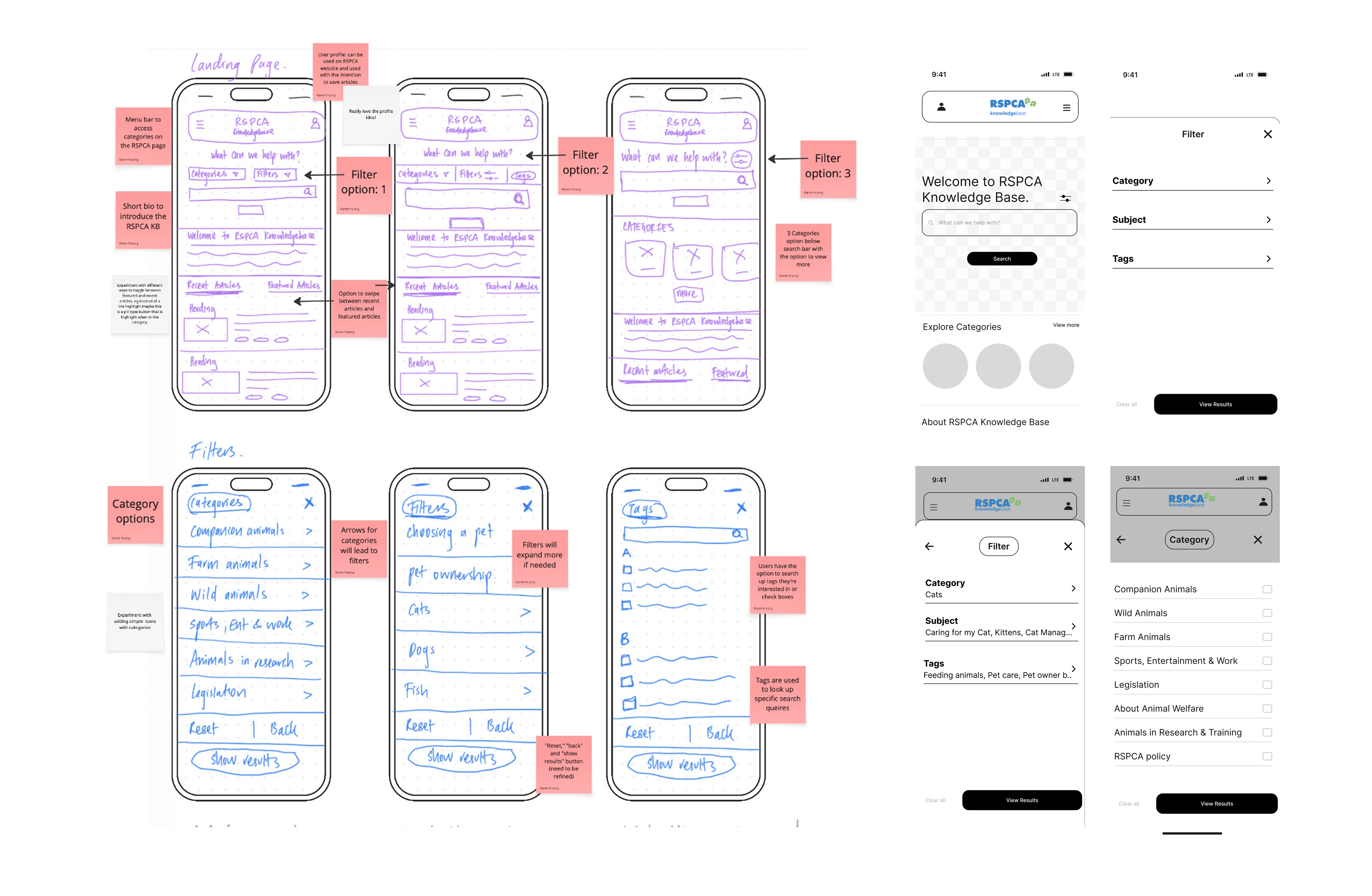
Home
Centred search and pet categories surface first.
Filter
Guided steps through animal category, subject and animal topic.
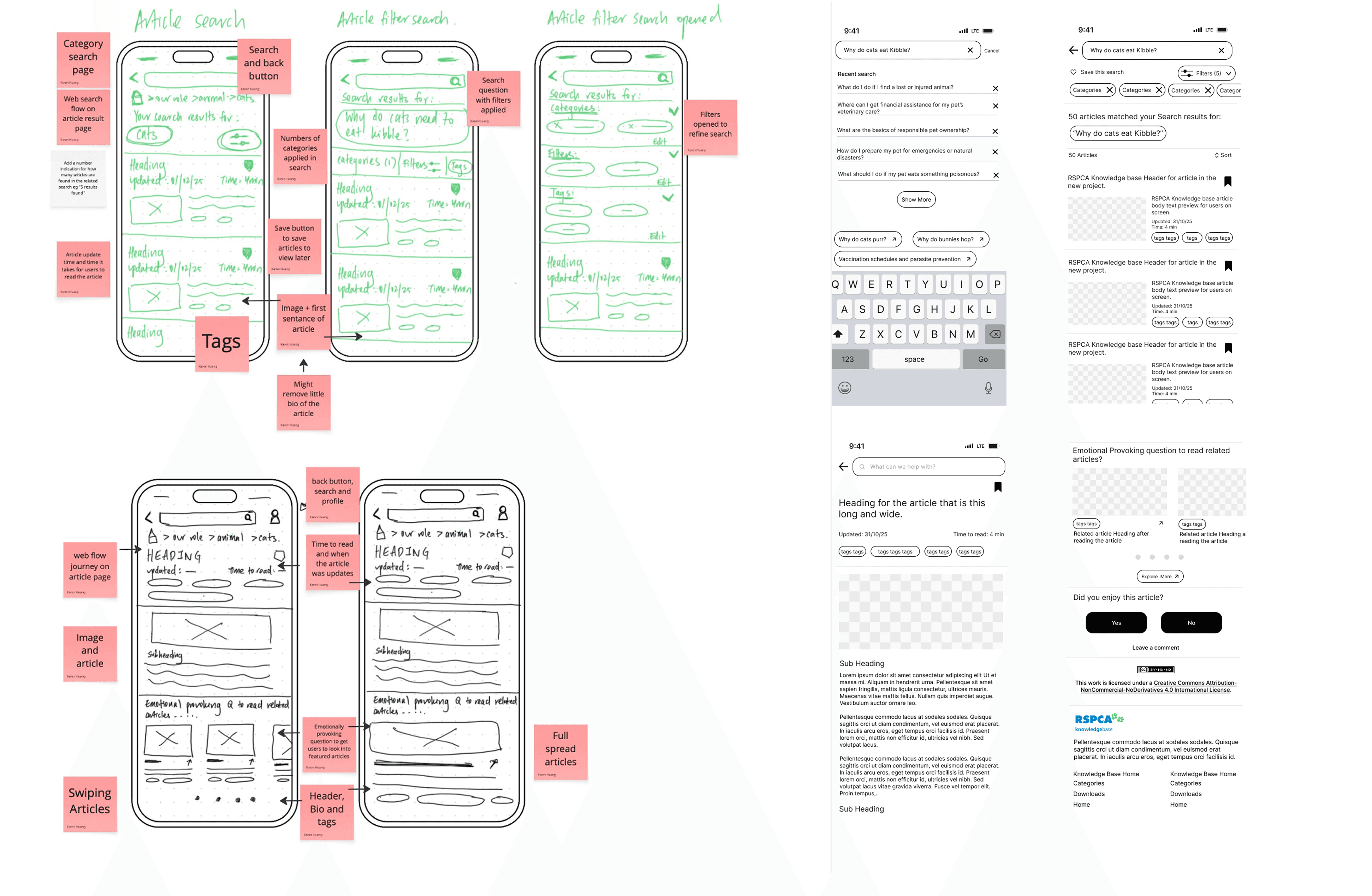
Search results
Image + header + tags cards replace the wall of text giving one decision per card for digestible scrolling.
Article Layout
22.3% (based on KB analytics) of users land directly on articles from external links, making this many users' first impression. I ended every article with related-article prompts so the journey doesn't have a dead-end (directly addressing Victoria's third theme).
USABILITY TESTING
I tested a mid-fi prototype with 4 participants (3 in person, 1 remote), all animal lovers recruited from my network. Four tasks, moderated, think-aloud.
The goal of these usability tests was to evaluate the functionality and usability of the filters section, and to determine whether the designs would resonate with pet owners enough to encourage return visits to the site.
Task 1 — Explore the home page
Mid-fi carousel showing the two pet carousels.
What worked
3 out of 4 participants liked pet articles grouped into swipeable topic carousels.
What broke
All 4 read 'Adopt a Pet' and 'Pet Care' as the same category. Identical layouts made them visually interchangeable.
What I changed
Gave each category its own identity through distinct components, colour, and an adoption quiz entry point.
"You could literally change this to ‘thinking about adoption?’ and then I feel like it would call back to adoption articles more."
Interview quote from usability tests
Task 2 — Start a search
Mid-fi filter showing page with terms that confuse users.
What worked
Colour-coded filter categories helped all 4 participants track where they were in the flow.
What broke
All 4 stumbled on terms like "downloads" and "animals in research and teaching," academic labels with no meaning to a pet owner.
What I changed
Removed or relocated academic terminology from the pet-owner filter path.
"What’s the relevance of that to me, as a casual pet owner?"
Interview quote from usability tests
Task 3 — Apply filters
Mid-fi filter with visually confusing and overwhelming elements.
What worked
Having filters laid out with its categories and a brief description provided guidance on the functionality of the page.
What broke
All 4 users pressed the 'Tags' header thinking it was a button. The outline made it read as interactive. Participants were also overwhelmed by the number of toggles and confused by the functionality of the tags section.
What I changed
Redesigned the header to be visually distinct from buttons. I replaced tags with single "animal topic" to specify user search.
"This feels like a button, I think, probably because of the outline."
Interview quote from usability tests
Task 4 — Find and read an article
Mid-fi articles layout with subheading and text.
What worked
3 out of 4 participants liked the images breaking up the text (the current site has one image per article, at the top).
What broke
Subheadings styled as buttons confused all 4; oversized body text in long paragraphs felt overwhelming.
What I changed
Shorter paragraphs, smaller body type, subheadings restyled as clearly non interactive.
“I’m just not used to the huge blocks of text, especially with the font size being so large."
Interview quote from usability tests
Home page
The home page has a button as a call to action to prompt users to start
Pet categories and pet related content is readily available.
Filter search
Users can use the filter to specify their search.
Users can return back to the main filter page to continue filtering or start their search whenever by clicking "view results."
Filter
Users have access to the filters they applied to their search.
Users can edit and delete the filters depending on their needs.
Article
The articles layout consists of smaller texts and sub headings
At the end of the article, call to action components are integrated to encourage users to continue exploring Knowledge Base.
80% of users said they liked that there were suggested related articles at the end.
FINAL DESIGN
Three principles drove the final prototype
Pet content first
Pet owners see their content in every surface.
One decision per screen
Cards, guided filters, and clear hierarchy replace walls of text.
No dead ends
Every article closes with a path to explore Knowledge Base.
Results — what I can actually claim
—> All 4 participants completed a filtered search and found a specific article unassisted
A task the current site doesn't support at all, since it has no filtering to begin with.
—> 3 out of 4 participants said the related articles section would bring them back
(The closest proxy I could measure for RSPCA's return-visit goal)
In post test, participants described the redesigned search as easier to scan, with no re-reading or backtracking observed (behaviour that was constant on the current site).
REFLECTION
What I learned
Restructuring dense information into scannable sections did more for findability than any single component I designed.
Building with spacing systems, grids, and reusable components kept the design consistent as it grew. My first real design-systems muscle.
Testing taught me to hold my decisions loosely: two things I was confident about (the tags section, the button-styled subheadings) failed with every participant.
What I'd do next for Knowledge Base
Test the current site and the redesign on identical timed tasks to produce a defensible before/after benchmark.
Validate the new filter taxonomy with actual Knowledge Base users, especially returning pet owners.
Check the redesign doesn't degrade the experience for vet students and farmers — the audiences I deliberately de-prioritised.
Feedback
Andrew Curin - RSPCA’s Digital Marketing and Strategy Officer
"The category organisation and pet colour coding was not only visually pleasing but also accessibility friendly. It makes the categories more intuitive and easy to navigate."
Candy Crowhurst - Senior UX designer, Mentor
"You did an excellent job highlighting accessibility issues within the current RSPCA Knowledge Base. This demonstrated a strong understanding of inclusive design principles and the importance of designing for a broad range of users."
Up next…
Karen Huang
Thank you for your interest in my work!
If you’re looking for a UX Designer who cares a lot and loves a good laugh, send me a message, I’d love to connect!
Lets chat